
Last modified: 2014-06-06 by rob raeside
Keywords: tarafal |
Links: FOTW homepage |
search |
disclaimer and copyright |
write us |
mirrors
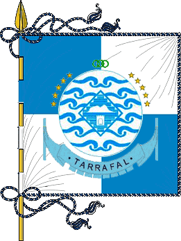 image by Jens Pattke, 3 June 2012
Tarrafal located in the northern part of the island of Santiago in Sotavento in Cabo Verde. The municipal population is around 18000. Under Dictator António de Oliveira Salazar the Tarrafal Concentration Camp was built on the plain south of town (Chăo Bom) to contain opponents of the political regime. The logo of Tarrafal municipality included the dark history of this place.
The flag is blue with the municipality logo in center. The banner is quartered blue and white, in center the logo of Tarrafal municipality.
http://www.cmt.cv/index.php?option=com_docman&task=doc_download&gid=78&Itemid=2 (2.3 Mb, pdf-file; page 31; in Portuguese) reports:
Memória Descritiva dos Símbolos Heráldicos do Município
HERÁLDICOS
leva em consideraçăo o estabelecido no Decreto-Regulamentar nş 8/2000, de 28 de
Agosto, publicado no B.O. nş 25-26 I Série, e os Termos de Referęncia da Câmara
Municipal do Tarrafal. Na sua concepçăo, procurou-se uma ideia fundamental que
pudesse ser expressa de uma forma simples, com força sufi ciente, capaz de
caracterizar e
individualizar o município, no contexto da sua importância na
ilha de Santiago de Cabo Verde. Simultaneamente, é um poderoso elemento de
marketing e das potencialidades do concelho. Como esse símbolo será integrado
numa bandeira, a expressăo dessa ideia deverá ser apercebida a uma distância de,
pelo menos, 30 metros. Uma eventual proliferaçăo de elementos gráfi cos e de
dimensőes reduzidas dos mesmos, necessariamente, enfraqueceria a composiçăo
estética e a expressăo de força que se pretende atribuir a esse Símbolo.
A
composiçăo do presente Símbolo Heráldico é formada por tręs áreas:
1 – A área
exterior, formada por ondas do mar;
2 – A área intermédia, formada pelo
desenho de Pano d’Obra Bitcho, e;
3 – A área central, formada pelo Monte
Graciosa e o ex-Campo de Concentraçăo.
Jens Pattke, 3 June 2012
Translated by Google:
Specification of Heraldic Symbols of the City
HERALDRY
takes into account the provisions of the Regulatory Decree No. 8/ 2000 of 28
August, published in the Official Gazette
No. 25-26 Series I, and Terms of Reference of the Municipality of Tarrafal.
A
fundamental idea was sought that could be expressed in a simple way with the
ablilty to characterize and individualize the municipality, in the context of
their importance on the island of Santiago in Cabo Verde with sufficient
strength in its design.
Simultaneously, it is a powerful marketing element and potential of the county.
As this symbol will be integrated into a banner, the expression of this idea
should be perceived at a distance of at least 30 meters.
Possible proliferation of graphical elements and reduced sizes necessarily
weaken the aesthetic composition and expression of strength that you want to
assign to this symbol.
The composition of the present Heraldic symbol is composed of three areas:
1 - The outdoor area, formed by the waves;
2 - The middle area formed by drawing Cloth d' Bitcho work, and;
3 - The central area, formed by Monte Graciosa and former Concentration Camp.